Subtotal $0.00 Subtotal: $0.00
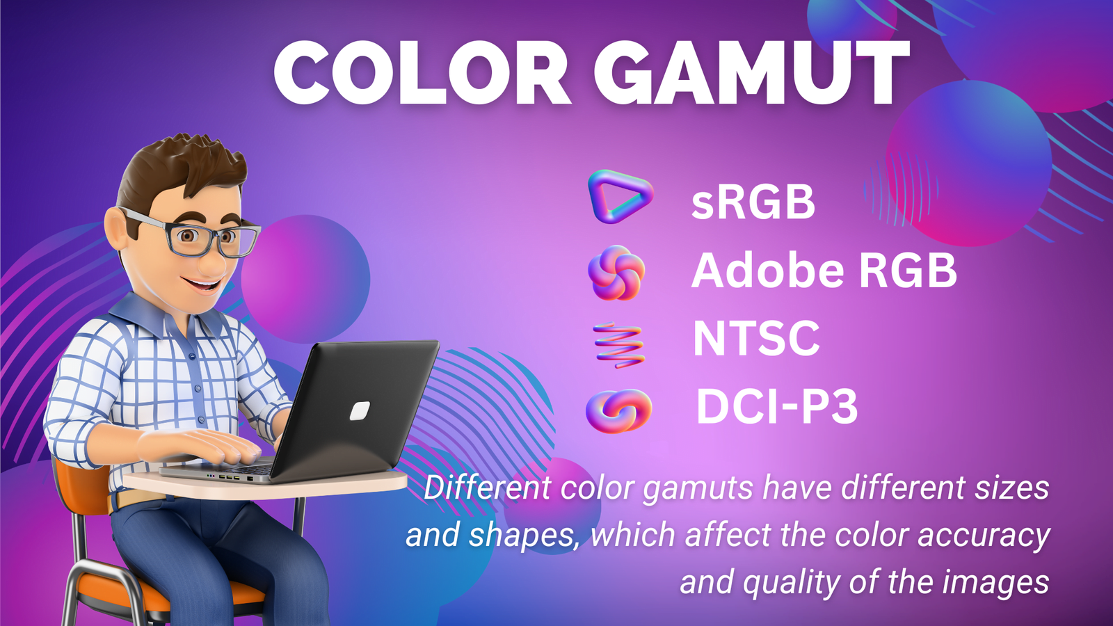
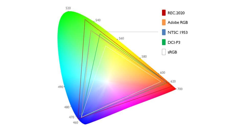
sRGB, Adobe RGB, NTSC and DCI-P3 are different color gamuts, which are the ranges of colors that a device can produce or display. Different color gamuts have different sizes and shapes, which affect the color accuracy and quality of the images. Here is a brief overview of each color gamut:
sRGB
This is the standard color gamut for web browsers, digital cameras, scanners, printers, and most monitors. It covers about 72% of the NTSC color gamut and 35% of the visible spectrum. It is widely used for general purposes and online content, but it may not be able to reproduce some of the more saturated colors in nature or art.
Adobe RGB
This is a larger color gamut than sRGB, covering about 100% of the NTSC color gamut and 50% of the visible spectrum. It is mostly used by professional photographers, designers, and printers who need more accurate and vivid colors. It can display more shades of green and cyan than sRGB, but it may not be compatible with some devices or web browsers.
NTSC
This is a color gamut that was originally used for analog television broadcasting in North America and Japan. It covers about 72% of the visible spectrum and has a wide range of colors, especially in the red and yellow regions. However, it is not very accurate or consistent, and it is rarely used today.
DCI-P3
This is a color gamut that was developed for digital cinema projection. It covers about 90% of the NTSC color gamut and 45% of the visible spectrum. It has a wider range of colors than sRGB and Adobe RGB, especially in the red and green regions. It is preferred by filmmakers and TV producers who want to create more realistic and immersive images.
If you want to learn more about these color gamuts and how they affect your images, you can check out some of these links:
I see that you are interested in matching colors on your print and display, as well as on your multiple monitors. This is a common challenge for many people who work with graphics, photography, or design. Here are some tips and resources that might help you achieve the best color accuracy and consistency possible.
- To match colors on your print and display, you need to calibrate both your monitor and your printer. This means adjusting the settings of your devices to make sure they display or print colors as accurately as possible. You can use the built-in color calibration tools in Windows 10 or MacOS, or you can use a hardware device called a colorimeter that measures the color output of your monitor and printer. You also need to choose the right color profile for your printer, which is a file that tells your printer how to reproduce colors on a specific paper type. You can use the default profiles provided by your printer manufacturer, or you can create your own custom profiles using a colorimeter and software.
- To match colors on your multiple monitors, you need to calibrate each monitor individually using the same method and settings. You can use the same tools as mentioned above, or you can use the display controls on your monitor to adjust the brightness, contrast, color temperature, and other settings manually. You can also use the graphics card settings of your computer to fine-tune the color output of each monitor. You can use the same background image or a test pattern on all your monitors to compare and adjust the colors until they look similar.
I hope this information helps you match colors on your print and display, as well as on your multiple monitors.